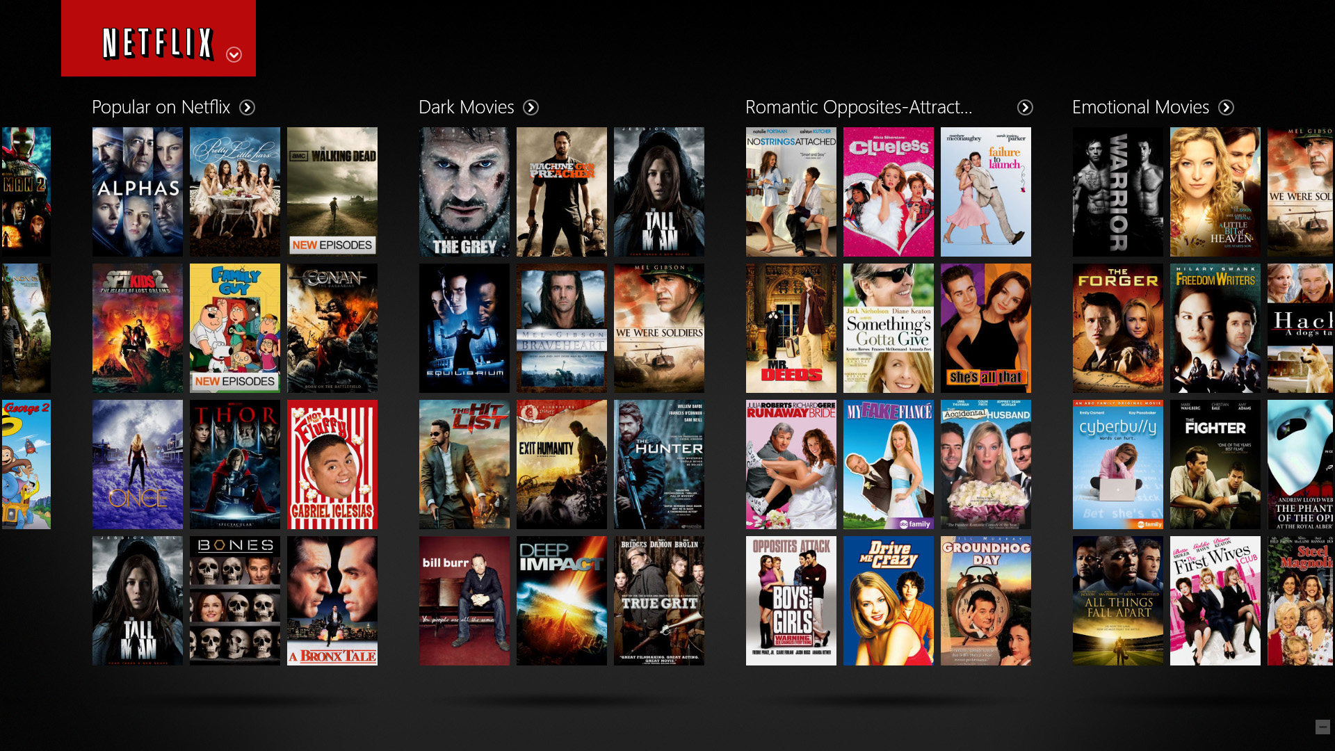
If you are like me, you might have experienced long tiresome moments when browsing and searching for something interesting to watch on Netflix. Majority of this browsing is usually constant scrolling up and down through the images of the content until I find something that catches my eye. When I do, I usually read the story of the title, the actors and rating to see if its worth a try. But often, there is nothing that catches my interest and I quit or settle on an old Friend’s episode.
As a data collecting savvy company, I wondered what Netflix did with this user behavior and whether it performed any experiments to see how the imagery affects the content watched.
In following up with this wondering, I stumbled upon two articles from Netflix, detailing the experiments they do with content imagery as a way to identify ways to improve viewership. Netflix knows that with all the large amount of content they provide, they have a short time to capture the attention and interest of users. Particularly, since the human brain can process an image in as little as 13 milliseconds [1]. In addition, they understand that imagery of their content is the most efficient and compelling way to do that [2]. In one of their consumer research studies, done in 2014, they found that the imagery was the biggest influencer to a user’s decision to watch content, and that it also constituted over 82% of users focus while browsing the content. They also found that users spent an average of 1.8 seconds considering each content that is available on Netflix, which is a very, very short time.
Knowing this, Netflix thus conducts several experiments to try and find a ‘right’ imagery that captures the attention and interest of the users in that short amount of time. The experiments are usually run using A/B testing (explained here). During the experiments (detailed more here), Netflix collects various measurements such as click through rate, aggregate play duration, fraction of plays with short duration, fraction of content viewed, etc. [3].
In this post, however, I would like to share some of their key learnings from conducting imagery experiments as a way to improve their service offering [2].
1. Images showing faces with complex emotions outperform stoic or benign expressions. They identified that seeing a range of emotions actually compels people to watch a content more. This could be because complex emotions have a better ability to convey a large amount information regarding the tone or feel of the content. This was observed for instance in their testing of a ‘right’ image of the second season of Unbreakable Kimmy Schmidt.
 |
2. Regional differences still exist, and are important for some content and imagery. A good example of when they observed the importance of regional presentation of a content and how it can impact its discovery among users around the world, was with the Sense8 TV Show. Sense8 has an international cast and storylines that give it a diverse appeal and makes it resonate with varying types of people. Thus, when developing the imagery for Sense8, this diversity was reflected in the final images, showing how much they varied between different countries and cultures.
 |
3. Personally, I have thought that villains more than heroes make or destroy a movie, especially in the case of action movies. Thus it was not surprising to me that one of Netflix’s finding was that using visible, recognizable characters (and especially polarizing ones) results in more engagement. In particular, Netflix found that their users respond to villainous characters surprisingly well in both kids and action genres. For instance, in Dragons: Race to the Edge, the two images of villainous characters seen below significantly outperformed all others.
 |
4. Three is apparently the upper limit of cast size one can show in the imagery. This is particularly for small sized artwork where a large cast size is not as effective in helping users decide to play a content. For huge billboards this might be the opposite though. During experimentation, Netflix observed this preference when they saw a drop tendency when an imagery contained more than three people. This finding directly informed their imagery for Orange is the New Black.
| Season 1
|
Season 2
|
Season 3
|


Based on the experiments, it is clear to Netflix that using better images to represent content significantly increased overall streaming hours and engagement from their members [2]. Many of the above four findings are intuitively known by many of us Netflix users, but it is always interesting to read what companies are doing to improve their offering and product experience.
Sources:
[1] Trafton, Anne (16-01-2014), In the Blink of an Eye. MIT News. Retrieved on 23rd July 2016 http://news.mit.edu/2014/in-the-blink-of-an-eye-0116
[2] Nelson, Nick (03-05-2016). The Power of a Picture. Netflix Media Center. Retrieved on 26th June 2016, https://media.netflix.com/en/company-blog/the-power-of-a-picture
[3] Krishnan, Gopal (03-05-2016), Selecting the Best Artwork for Videos through A/B Testing. The Netflix Tech Blog, 26th June 2016, http://techblog.netflix.com/2016/05/selecting-best-artwork-for-videos.html