In one of my earlier post, I analyzed the Shark Tank data to gain some insights on the distribution of deals among industries and presenters’ genders. In this post, I want to present a more visual exploration of the data as a way to also gain more practice using R’s Shiny package.
There is nothing sophisticated in the visualization App itself, there is a UI and a Server part that allows you to visualize information regarding the deals that have been made on Shark Tank.
The App has been made available here, and the code for the App can be found here.
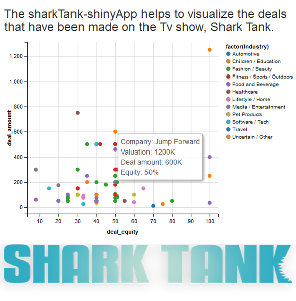
The right-hand side of the App displays a scatter plot showing all the companies that have gotten deals. The y-axis shows the deal amount, while the x-axis shows the equity that was given in the deal.
Upon hovering on each point, you get more information, including the Name of the company that got the deal and the Valuation amount. The deals are also colored by the Industry it belongs to.

On the left-hand side, the App allows you to select:
– The maximum deal amount – whereby the App responds to show you all the deals made under that amount.
– The Season – the App shows you only the deals made in that season. I have only added 3 seasons worth of data, but more seasons can easily be added to the csv file and will be reflected accordingly in the App.
– The Gender – the App shows you only deals where the presenters are of that selected gender.
As future work, it will be good to allow the user to make a selection and see deals made by a particular Shark on the show.
Also published on Medium.
